De Stijl means ‘the style’ in Dutch also it has another meaning 'a post' jamb or support (Overy, 1991, 8). the first seen for De Stijl was in the city of Leiden in 1917 by a group of artists and architects also it was a response to the trauma of the first world war (Eskilson, 2007, 187) .De Stijl represented as one of the major ‘modern movements 'since the first attempts to construct histories of early twentieth century art ‘architecture and design in the 1920s (Overy, 1991, 7). De Stijl was the core of movement, allowing the artists to promote their art and ideology to expander public like Theo van Doesburg (Eskilson, 2007, 188).
There were many artists who had an important effect to De Stijl art and they all shared developing this art and show it in different ways in our daily movement such as painters Piet Mondrian, Vilmos Huszar, Bart van der Leck and the painter, designer, writer, and critic Theo van Does burg, these were often aware of the development of each other's work and produced paintings which have stylistic and conceptual characteristics in common (Eskilson, 2007, 187). The architects Robert Van't Hoff, Jan Wils and Frank Lloyd Wright. The sculptor and painter Georges Vantongerloo also the furniture designer and architect Gerrit Rietveld (Overy, 1991, 7). These were the artists and architects most closely involved with De Stijl.
There works were based on using of horizontal and vertical lines as well as right-angled geometric shapes. Only the primary colors were used in conjunction with black, white and grey to create the "abstract expression" of "pure reality" and the relationship between positive and negative elements in an arrangement of non-objective forms and lines (Overy, 1991, 11). The artists who created De Stijl, their designs and daring forms were often considered strange and shocking at their time, but now a days De Stijl had become a fact in our world and in present life it became a major part in our life, we can notice that this kind of art surrounds us in every place everywhere such as; furniture, clothes, carpets and packaging (Warncke, 1991, 9). Despite the art movement of De Stijl, it comprised a group of people who wanted to act as agents of social change.
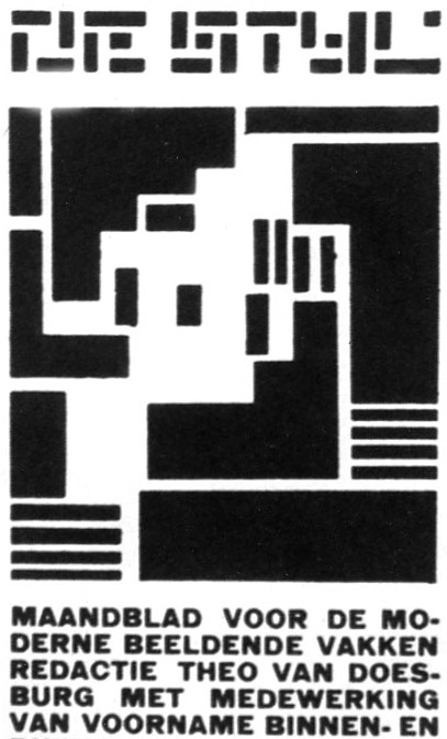
There are many examples of De Stijl who had their positive effect on typography Like, Van Doesburg contacted Mondrian and in 1917 they co-founded the De Stijl journal (Eskilson, 2007, 188). It was shown as an example of the group's principles of typography and graphic design also it made up of illustrations and articles about the ideals of artists of that time (Eskilson, 2007, 188) (fig1).

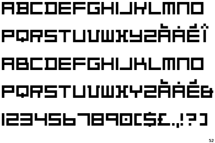
One of the things that made journal the point of people attraction is the cover page combined a logotype made by Van Doesburg attached with a wood cut designed by Vilmos Huszar (Eskilson, 2007, 189). The logotype letters were simple that there were consist only of squares and rectangles organized on horizontals and verticals, more over Van Doesburg changed the square shapes in a way to create the alphabet letters, that’s called ''geometric scheme'' an divided them into twenty five equal parts, he gave a key design element by using pure neoplatonic forms ''the grid'' underlies graphic design and typography (Eskilson, 2007, 188) (fig 2).


fig 2, Theo van Doesburg, Alphabet, 1927, URL
In 1921 the De Stijl journal was redesigned by Mondrian with Van Doesburg to increase the journal population and attract the European audience, also the subtitle changed to ''international monthly'', therefore the articles written in wider known languages especially French due to Mondrian visited to Paris and being shocked by the weakness of De Stijl comparing with the art there (Eskilson, 2007, 189). The features of the new cover page based on the title De Stijl printed in black on top of the red letters ''NB-nieuwe beelding'' (Eskilson, 2007, 189) (fig 3).

fig 3, Theo van Doesburg, NB De Stijl, 1921. art journal, URL
There were many commercial works and painting which served De stijl and supported it at the time of its beginning like the designer Bart van der Lecks , His works had attracted Muller& Co shipping company to make them their Poster at 1915 about the company (Eskilson, 2007, 192). The vessels, cargos and their rout by a simple poster at the first seen, but its completely at the opposite side, this poster make a connection between commercial production and fine art designers , van der Leck's poster had given more meaning about perception of the firm to drum up business, the features were highly structured that contained many details and gived fully known of the company business (White,2003, 82). van der leck use primary colors that shows his simplicity, the ship were black , its overall is one horizontal mass and shaped by bold horizontal and vertical rules he make the poster that it fits the frame and make the width equal at both sides, he draws the accommodation with the life boats and the smoke pours out from the stack above the M with the cranes and waves slumming the ships bow , the title BATAVARIAN-LINE were had been taken to make the patriotic association with the batavarians , this poster make it clear, Big business had taken the lead from the government an directing foreign relations (Overy, 1991, 60); (White, 2003, 82) (fig 4).

Bibliography:
- Warncke, C. P. (1991). De Stijl 1917-1931. Germany: Benedikt Taschen Verlag GmbH & Co.KG.
- Overy, P. (1991). De Stijl. London: Thames and Hudson Ltd.
- Eskilson, S. J. (2007). Graphic Design A New History. North America : Yale University Press.
- White, M. (2003). De Stijl and Dutch modernism. Britain: Manchester University Press.
- The Influence of DE Stijl as an Art movement (Brent Coulton). (n.d).
Retrieved January 26, 2010, from www.discovery.mala.bc.ca/web/coultonbm/webpage.htm.
I love the topic and the style of typography. Looking good. Please ad a paragraph space between the last line of the paragraph and the image that follows. It will look much better. Well done. - Nicos
ReplyDeleteCan you please find some examples other than the ones that you have. They are all from the text book. You can search the Graphic Design Museums. I gave you a big list. Your links are fine. After the presentation I would like a hard copy of the text only, not the images.
ReplyDelete